Oakridge
Home Building

Oakridge is a a contemporary home building company creating considered homes with a focus on thoughtful design, quality craftsmanship and lasting liveability.
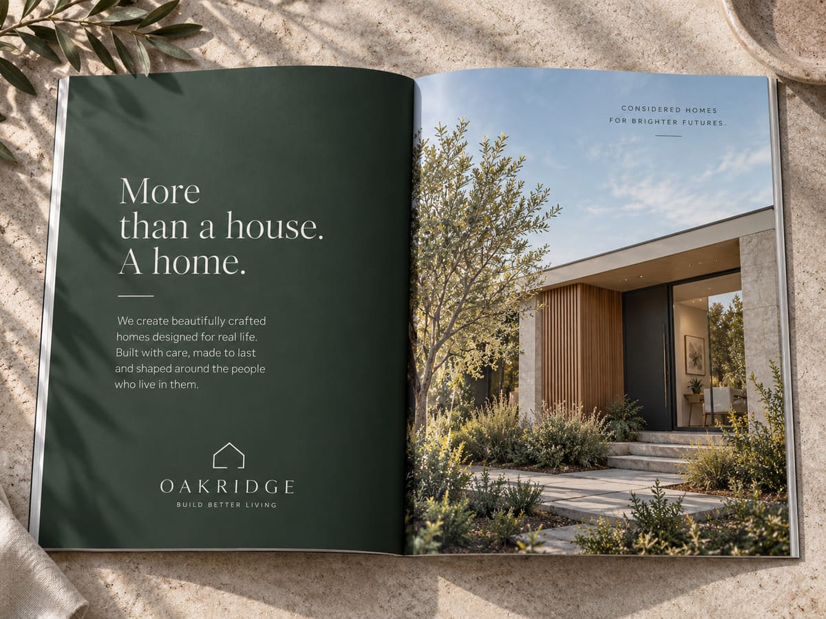
View ProjectThe Oakridge identity takes cues from contemporary architecture and natural materials. A restrained palette of warm neutrals, stone tones and deep green creates a sense of permanence, while clean typography gives the brand a confident and modern presence. The result is an identity that feels at home across everything from building sites and signage to client presentations and marketing materials.
Residential Home Building
Brand Identity
Print Design
Digital Experience
Logo & Identity
Print Collateral
Digital Assets
Social Media
2026
A considered expression
of modern living.
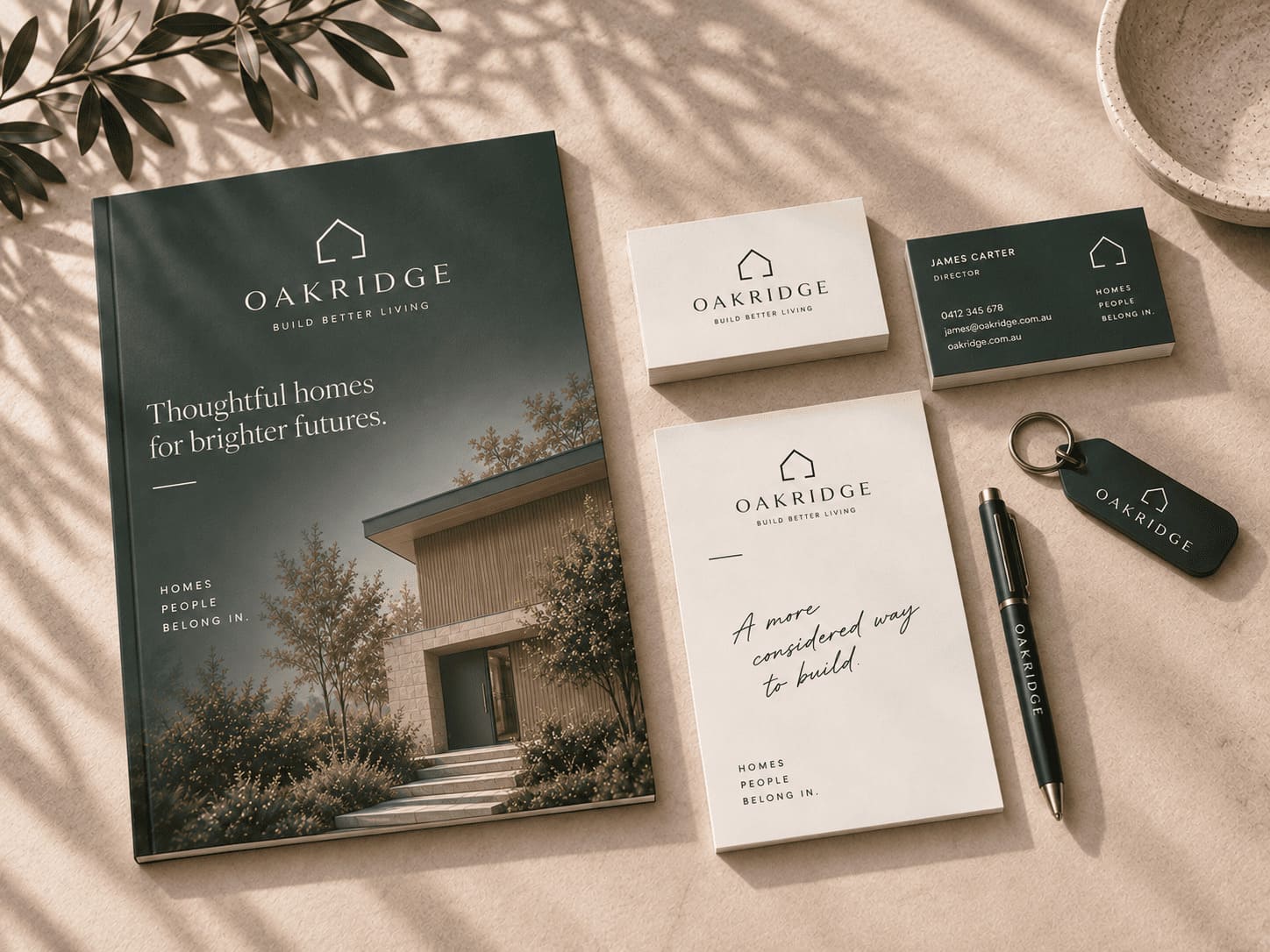
A simple, structured identity designed to communicate stability, precision and considered construction.
The palette combines deep architectural green with limestone, stone and warm neutral tones. The result is understated rather than overly corporate, giving Oakridge a distinctive presence within the residential building market.
Playfair Display introduces a refined architectural quality to headings, while Montserrat provides a clean and highly legible supporting typeface.
Designed to build confidence from the ground up.
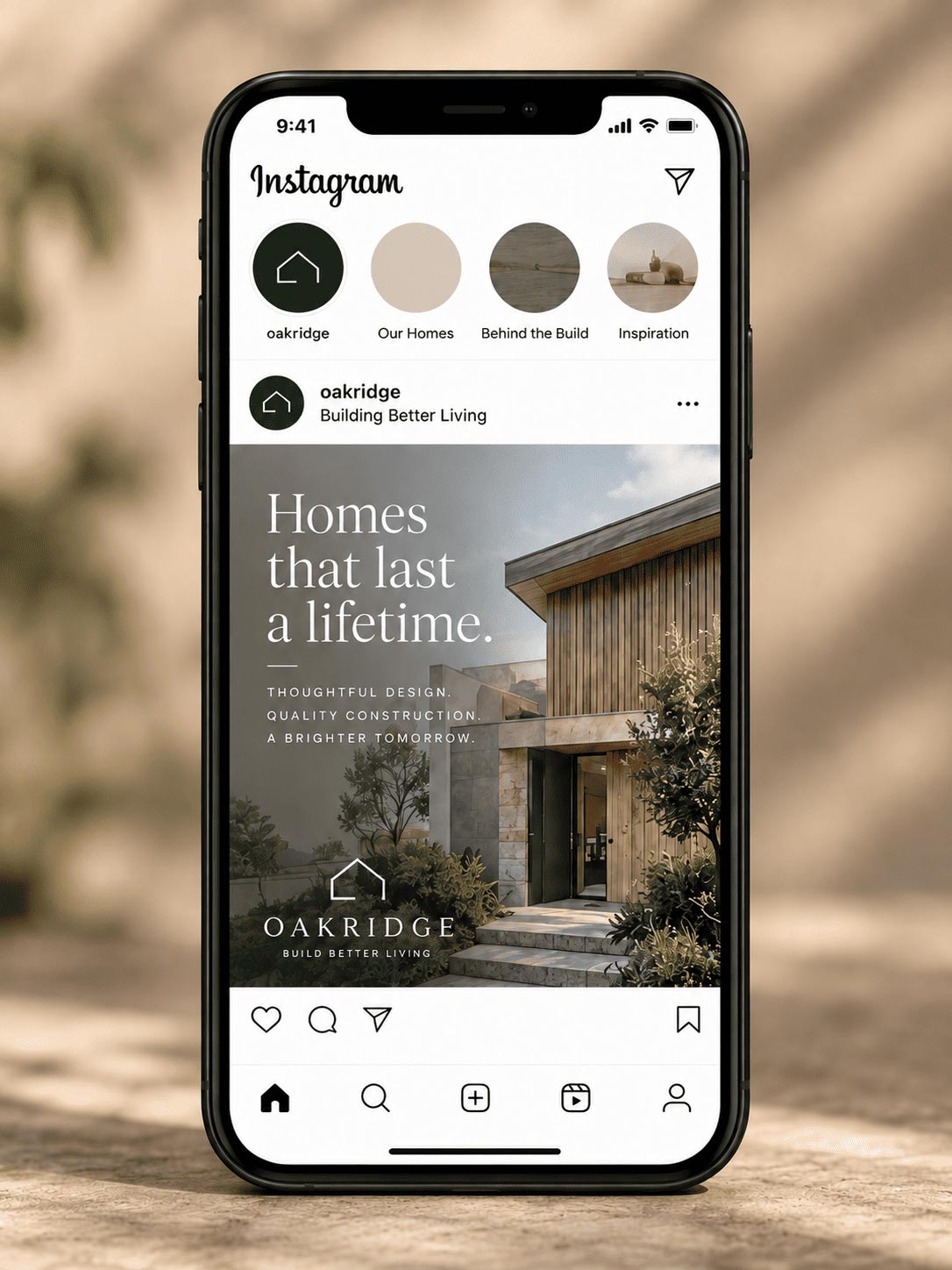
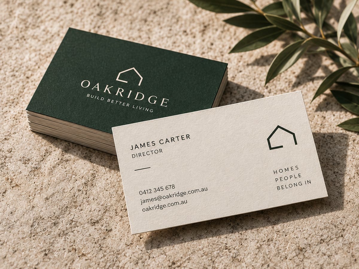
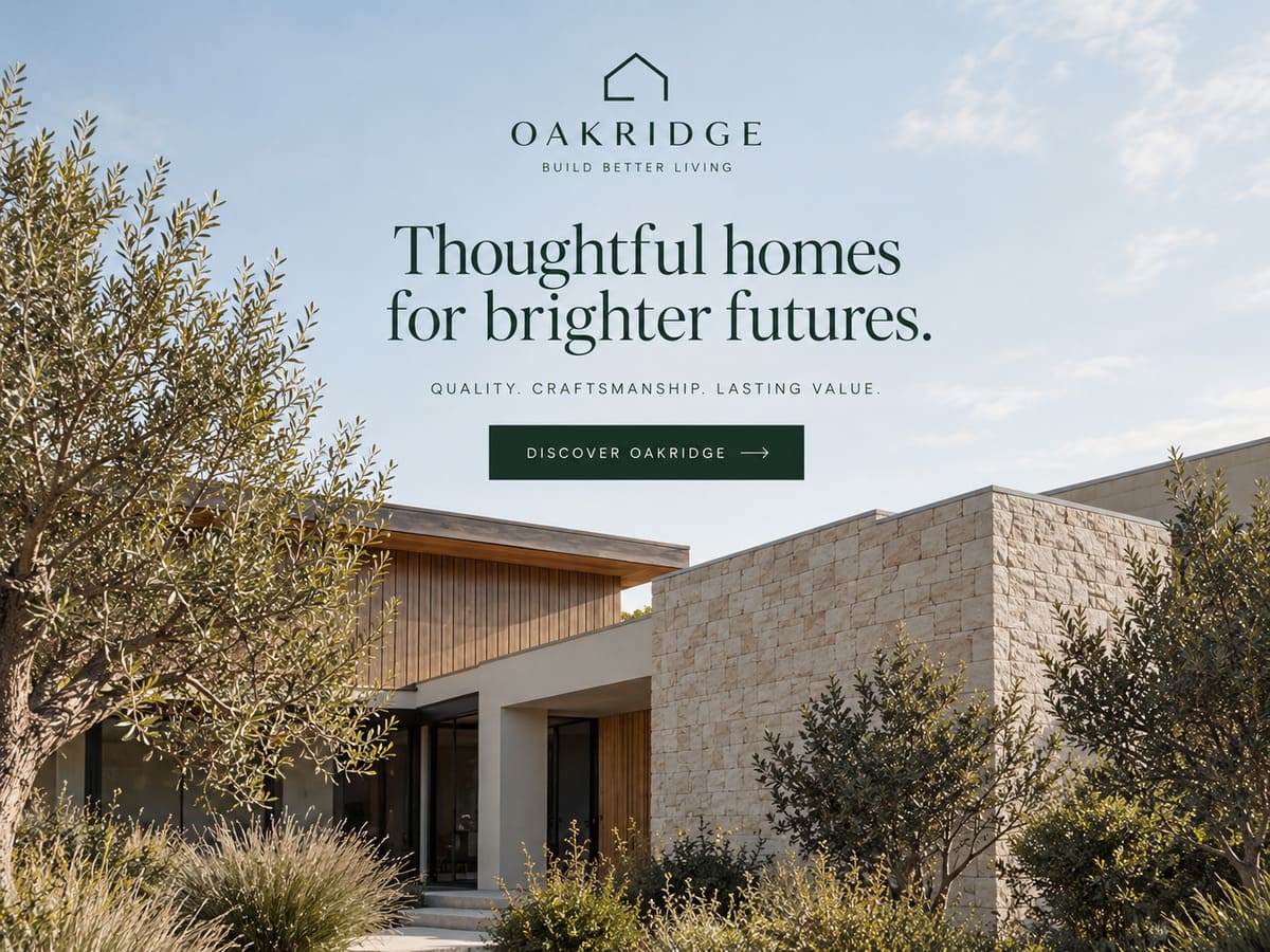
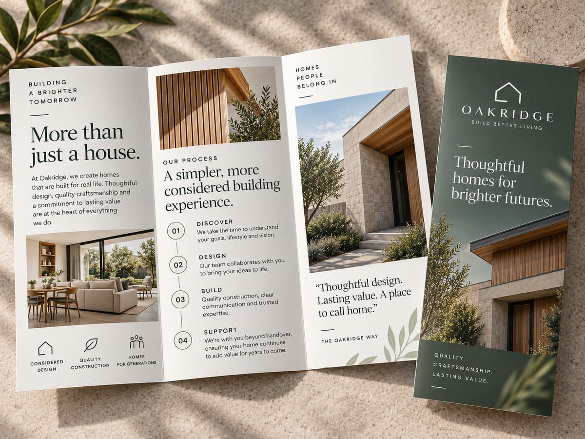
A brand built to stand with the homes.
The new Oakridge identity gives the business a distinctive and credible presence across its customer journey. It balances the precision of construction with the warmth of residential design, creating a brand that feels established, considered and built for the long term.