Witson & Co.

Witson & Co. is a considered homewares brand built around natural materials, enduring design and the quiet rituals of everyday living.
View ProjectWitson & Co. needed a brand identity that reflected their philosophy of slow, intentional living. The goal was to create a timeless visual identity that feels warm, refined and rooted in natural materials.
Homewares
Brand Identity
Print Design
Packaging
Logo & Identity
Brand Guidelines
Packaging
Print Collateral
2024
A considered identity
rooted in the everyday.
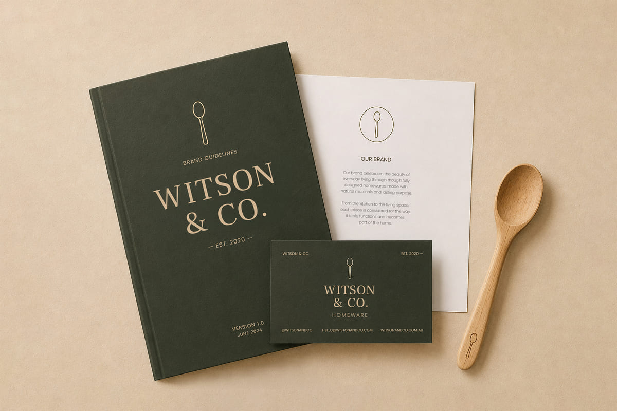
The Witson & Co. identity was created to reflect the brand’s philosophy of elegant, intentional living.
The simple wooden spoon is at the heart of the mark — a symbol of warmth, functionality and the everyday rituals that bring people together.
A natural colour palette, timeless typography and considered details create an identity that feels refined, enduring and true to the brand.

Designed to live beyond the page.
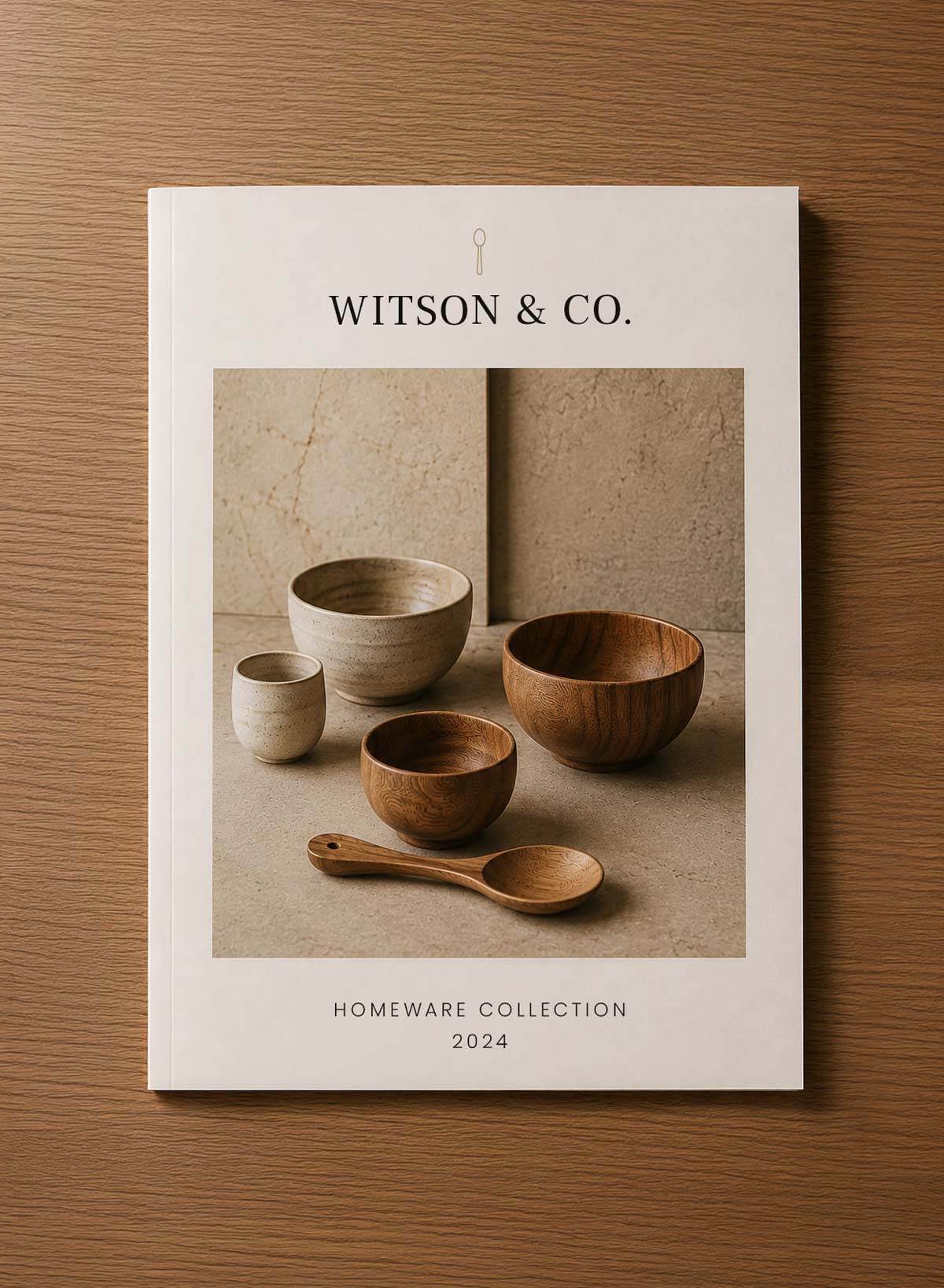


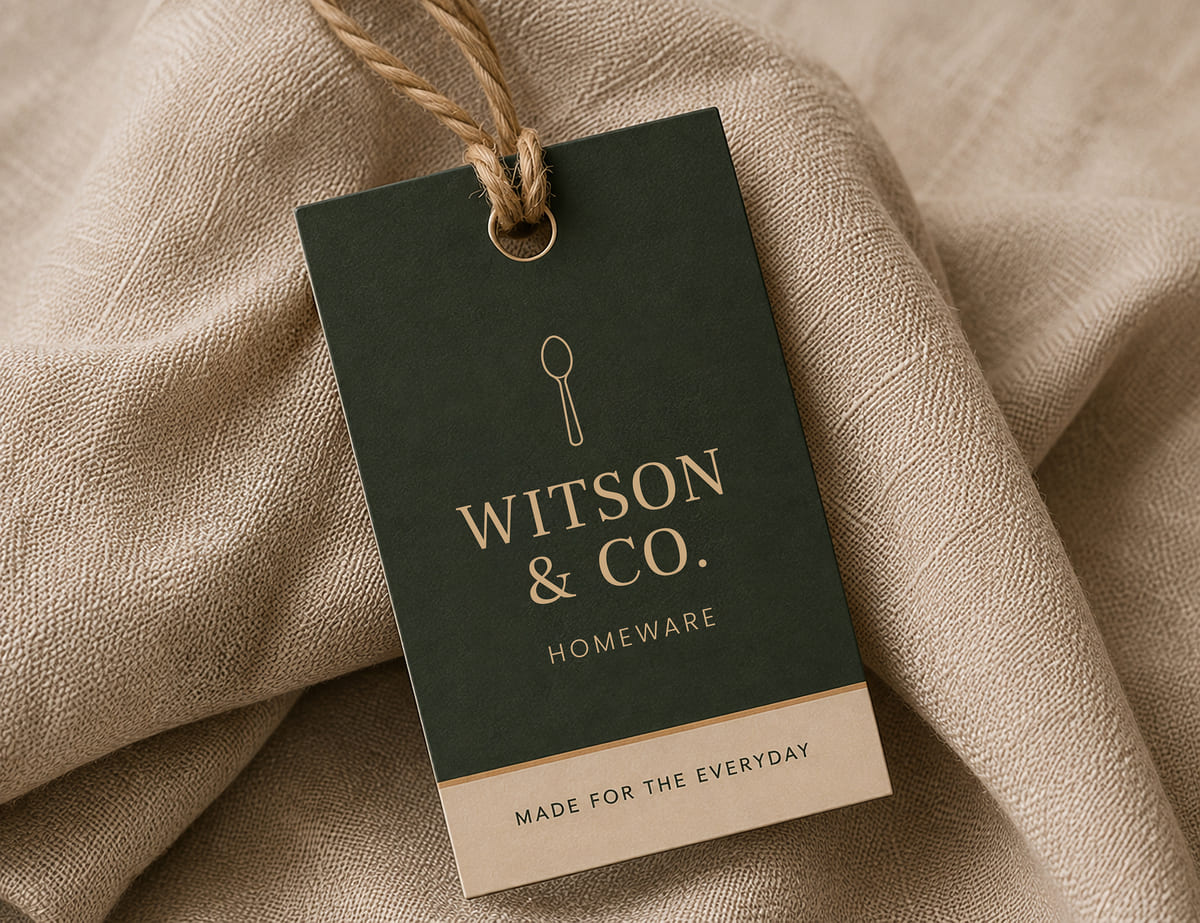
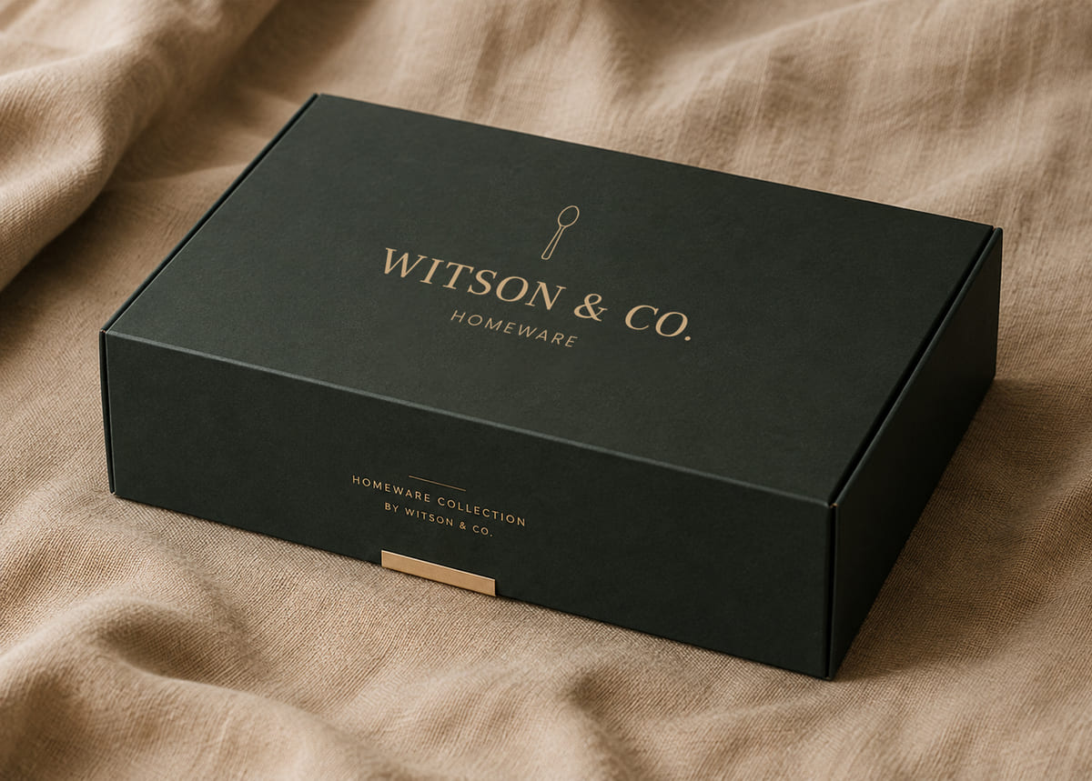
A warm identity made to last.
The new brand identity gives Witson & Co. a strong, cohesive foundation across every touchpoint. It captures the essence of the brand — calm, considered and beautifully made — while creating a visual language designed to grow with the business.